Good news! We have doughnuts and pies on the menu, and a lot of really powerful improvements that can make your M.App Analyzer Views much more user-friendly.
Show Doughnut Charts in Cluster Markers
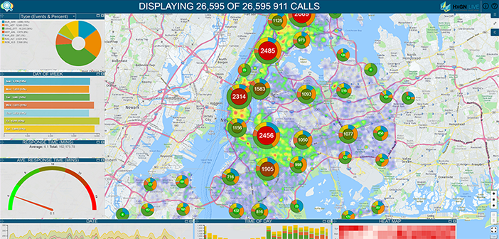
Cluster markers let you see how many events have been collected together into a single marker. Now you can add a doughnut chart to the outside of that marker, giving you insight into the event categories that comprise the cluster.
Go to the Colors tab and select Doughnut from the Theme dropdown list.
In this example, the Theme chart in the upper left is changed to show four levels of Priority (Events & Percentage).
This information, like any thematic, can now be used to thematically depict the distribution of the events within the cluster markers.
Notice how the doughnut charts update as date and time of day ranges are changed, and the slices of the pie chart are clicked. Use this method of when you want to better understand the distribution of classes within your data. Note that the total number of incidents in each cluster is still displayed.
Convert Cluster Markers to Pie Charts
Like doughnut charts, pie charts give a visual depiction of the distribution of the calls within each cluster. Pie charts do not show the total number of incidents within each cluster, but the relative size of each slice indicates how many incidents are in each cluster. Unlike the doughnut charts, the number of incidents in the cluster is not displayed.
To modify cluster markers to show pie charts, go to the Colors tab and select Pie from the Theme dropdown list and set some optional display options, such as Size.
In this example, the Theme chart in the upper left is changed to show four levels of Priority (Events & Percentage).
Notice how the pie charts update when you select some time of day and date ranges. . Use this form of instant feedback to visualize the nuances within your data.
Auto-Locate Data from the Table Chart in the Map View
Sometimes it is difficult to correlate the data in a chart with the spatial data in the map view.
To easily locate a specific feature within the map, select a Data Table chart, then go to the General tab and check the box next to Enable geometry locate.
Once you click the Apply button, a pin marker is placed in each row of the Data Table.
Click several of the pin markers and see how the map zooms to the related data row.
Number Display Chart Improvements
A Statistical reports are typically displayed in a Number Display chart, but a simple number or line in a chart is often not enough to convey meaningful information about your data. You can now build custom-coded Number Display charts to open in your Analyzer views.
Statistical measures such as Minimum Value, Maximum Value, Standard Deviation, Median, Variance, and Range values can be displayed in your Number Display charts.
Creating reports with advanced styling is as simple as pasting in the HTML code.
Here we have four different examples of Number Display charts.
If you can dream it up in HTML, the Number Display chart can be used to display your code. This includes a wide array of reports and even full-blown web pages with embedded graphics and hyperlinks.
Tooltips for Boundary Layers
Feature data and Boundary data can contain meaningful information and attributes. Now you can display that information in your view using tooltips.
Go to the Tooltips tab and click the Boundary Data tab and add attributes accordingly.
Once the attributes are in place, use the Preferences to make sure tooltips are enabled for one or more of the data sources.
Toggle appropriate layers on to display them and in turn display the tool tips.
Change which set of tooltips you want to have available by dragging the preferred layer to the top of the layer stack.
If tooltips are disabled, you can use the Boundary layer or Feature layer to filter your data.
More External Web Services Support
Now there’s an easier way to access external data services.
All of the connection parameters are in one tab called External Services in the Data Sources tab. Go to External Services tab, select any of the supported service types:
- Web Service
- ESRI Map/Feature Service
- Where’s My Transportation
- Web Feature Service (WFS)
Enter the required connection information, click Apply and start using that service.
To see all of the new features we have baked into Incident Analyzer, Area Analyzer, Network Analyzer, and Feature Analyzer, watch the webcast.
To or buy Smart M.Apps in the M.App Analyzer Suite, visit the store.


