Have you experienced one or more of the following symptoms lately: coughing, sore throat, head ache, fevers, muscle ache? If it can comfort you, you’re not alone. The flu epidemic has hit a milestone that hasn’t happened in over a decade.
Nowadays authorities are closely monitoring the outbreak, but this hasn’t always been the case with contagious illnesses in the past.
The Early Symptoms
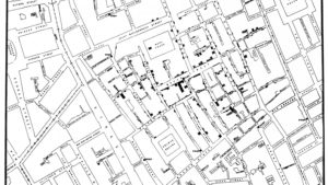
On 31 August 1854, a major outbreak of cholera occurred in Soho, London. By the end of the outbreak, 616 people had died. At that time cholera was believed to be spread by miasma in the air, and the sudden and serious outbreak of cholera in London’s Soho was considered a mystery. Enter John Snow, not to be confused with his namesake from A Game of Thrones, but a physician who didn’t believe cholera to be an air-borne disease. By plotting deaths as they occurred on a map, he was able to identify a pump on a road called Broad Street, as the common factor to them all. He subsequently published a map of the epidemic to support his theory that cholera is spread through the water.

John Snow’s well known cholera map is often cited as one of the earliest known examples of using geographic inquiry to understand a health epidemic. The map was important because it was not just a presentation of data. An attempt was made to present an argument developed from a spatial analysis of data displayed on the map. Today maps are still used to understand a health epidemic so we can assume that John Snow has spread the map virus. However the virus has mutated because since 1854, maps have significantly evolved.
Finding a Cure
First of all, maps have been digitized which enables dynamic visualizations, including moving elements and interactive filtering. In the video below you can see the tool Luciad developed for the University of Leuven, Department of Microbiology and Immunology to analyze hepatitis C migration in space and time. Phylogenetic trees are visualized on a geographic map and can be filtered. The colors used in the corresponding timeline at the bottom of the screen match the colors on the geographic map and provide additional insight.
The case study, Integrytis Visualises the Impact of Pollution on Public Health, shows another example of how maps can be used to understand health epidemics by explaining how Integrytis is using Luciad to visualize the impact of pollution on public health.
If you also got infected by the map virus, I suggest you subscribe onto the LuciadDeveloper platform. You’ll definitely find a cure there!


